

Adding a Personal Touch: Custom Canvas Artwork for Every Space
Canvas artwork can transform any room into a personal haven. Whether it's a cozy living room or a tranquil workspace, custom creations bring your unique vision to life. In this blog, we'll explore the benefits of custom canvas art, tips for selecting the right pieces, and creative ways to display them throughout your home or office.

The Power of Personalization in Home Decor
Personalizing your home decor is essential for creating a nurturing environment. Custom canvas artwork can serve as a focal point that reflects your tastes and preferences, making any space feel unique and inviting.
When you think about personalization, consider the emotions you want your space to evoke. Custom canvas art isn’t just decoration; it's an expression of your identity. The colors, themes, and even the subjects of the artwork can convey feelings of comfort, joy, or inspiration. For instance, a vibrant piece might energize a work-from-home office, while a serene landscape could create a calming atmosphere in a bedroom. By selecting artwork that resonates with you, you allow your personality to shine through every nook and cranny of your home.
It’s also worth mentioning that personalization extends beyond aesthetics. Your chosen canvas artwork can tell a story—one that belongs uniquely to you. Whether it’s a piece that recalls a cherished travel memory or one that represents a significant milestone, these artworks provide context and meaning to your living space. They create a narrative that transforms mere walls into vibrant storytelling canvases, engaging guests and sparking conversations.
Choosing the Right Artwork for Your Space
Selecting the perfect canvas artwork involves considering factors like room size, color schemes, and personal interests. Explore how to choose pieces that complement each space while resonating with your style.
Begin by evaluating your space and how you want it to feel. Bright colors can uplift the mood and energize a space, while muted tones offer a more calming effect. Imagine standing back to view your room; what colors stand out? Once you establish a palette, let that guide your search for canvas artwork. Not only will the colors harmonize with your furnishings, but they will also foster an environment that is appealing to you and your visitors.
Also, consider the scale of the artwork in relation to your space. A large canvas can act as a stunning centerpiece in an expansive room, drawing the eye and sparking interest. Meanwhile, smaller pieces can be grouped together to create a gallery wall that feels intimate and inviting. But don’t be afraid to play around—art often breaks the rules! Mixing both large and small pieces can create a dynamic look that keeps your space feeling fresh and exciting.
It's not just about aesthetics, either. Think about what resonates with you on a personal level. Ask yourself questions: Do you prefer landscapes that evoke travel? Or perhaps abstract pieces that inspire thought? Aligning your artwork with personal interests ensures that your curated collection will continually inspire and uplift you, making your home not just a place to live, but a sanctuary of your interests and passions.
Understanding Different Styles of Canvas Art
From abstract to landscape, the world of canvas art is vast. We'll delve into various styles and how each can influence the mood and aesthetic of your home or office.
Understanding the specifics of different styles of canvas art can greatly enhance your selection process. For instance, abstract art tends to evoke emotions through shapes and colors, leaving interpretation up to the viewer. This makes it an excellent choice for spaces meant for brainstorming or creative endeavors. The energy of the piece can inspire innovative thinking and bring a lively buzz to an otherwise mundane setting.
Conversely, landscape art carries a sense of serenity and adventure. These pieces often include natural scenes or cityscapes, pulling you into a tranquil state of mind. Think about navy mountains or vibrant sunsets that could add warmth to your living space—an invitation for relaxation after a long day. Choosing a landscape that speaks to you personally can transport your mind back to a cherished vacation or a favorite outdoor retreat.
Moreover, there are styles like modern minimalist, focusing on simplicity and clean lines. This type of art can be particularly beneficial in contemporary homes with sleek furniture. It's all about the background. When paired with modern decor, it places the emphasis on the beauty of the negative space around it. Understanding these nuances allows you to better choose pieces that not only fit your taste but enhance both your space and your lifestyle.
Displaying Canvas Art: Creative Arrangements
How you display your custom artwork can transform a room. Discover creative arrangements, such as gallery walls, and tips for maximizing impact while ensuring harmonization with your existing decor.
One popular arrangement is the gallery wall, where multiple pieces are displayed together to form a cohesive look. To achieve this, select a variety of artworks that complement each other, considering similarity in color schemes, frames, or subject matter. Lay them out on the floor before committing to the wall to get a sense of how they work together. The goal is to tell a unique story that exemplifies your personality.
On the other hand, single statement pieces can hold their own by being placed as a focal point. Think about hanging a large canvas above a sofa or in a hallway. Such positioning draws the eye and sparks interest from anyone passing by. Don’t shy away from bold choices here; a vibrant piece can act as the perfect contrast to neutral surroundings, injecting some life into the room.
Lastly, consider utilizing varying heights and simple layering techniques. Using a shelf to display smaller artworks alongside plants or books can create an effortless, chic look. When arranging multiple pieces, remember to maintain consistent spacing to avoid overwhelming the visual presentation. Mixing different styles and sizes not only enhances creativity but encourages conversation and engagement in the space.
Incorporating Personal Memories into Canvas Art
Infusing your canvas artwork with personal memories can be incredibly meaningful. Learn how to incorporate family photos or cherished moments into custom pieces that become conversation starters.
Consider utilizing custom prints that transform your family photos or memories into beautiful canvas art. These can be crafted in a variety of styles, allowing you to merge your personal experiences with artistic flair. So, instead of simply standing on a shelf, these memories can be displayed prominently for everyone to admire, creating a backdrop rich with your personal history.
Moreover, integrating pieces that commemorate special moments is a great way to fill a space with stories. Imagine an artwork representing your wedding day or a family gathering captured forever on canvas. Not only will these pieces beautify your home, but they also serve as constant reminders of what you cherish most. Over time, they become conversation starters, inviting guests to engage with your story.
Ultimately, bringing together memories and art allows you to curate a space that feels deeply personal. Choose images that evoke fond memories or create a mood board that encapsulates your life's journey. Your custom canvas artwork will become much more than just decoration; it will be a reflection of your life’s narrative, enriching your space with memories that are unique to you.
Embrace Your Creative Space
Adding custom canvas artwork to your space not only enhances its aesthetic appeal but also imbues it with your personality and creativity. By considering your style, choosing quality materials, and experimenting with personal touches, you can create an environment that truly reflects who you are. Start your journey towards a more personalized space today!

Understanding the Role of Printing Services in Safety Signage
Safety signage is an essential aspect of maintaining a safe environment, whether at work, in public spaces, or within our homes. Often overlooked, the role of printing services in creating effective safety signs cannot be understated. In this blog, we'll delve into how printing services contribute to the quality, clarity, and compliance of safety signage, ensuring that messages are effectively conveyed and understood by all.

The Importance of Clear Safety Signs
Clear safety signs are vital for conveying important information quickly and effectively. They serve as the first line of communication in many situations where time is of the essence. When individuals encounter clear signage, they can make informed decisions promptly, reducing the likelihood of accidents and injuries.
In environments like construction sites or manufacturing facilities, the clarity of safety signs can mean the difference between a safe workspace and a dangerous situation. Moreover, simple and unambiguous messages can eliminate confusion, helping people understand the actions they need to take in emergencies.
In addition to life-saving capabilities, clear signs foster a culture of safety within organizations. Teams that prioritize clear communication through effective signage demonstrate a commitment to employee well-being, which can boost morale and productivity.
The Role of Printing Services in Creating Effective Signs
Printing services ensure that safety signs are not only high-quality and durable but also compliant with regulations. This includes choosing the right materials that can withstand environmental conditions while retaining their legibility. For instance, UV-resistant inks and weatherproof materials are crucial for outdoor signs.
Furthermore, many printing services offer advanced design capabilities that incorporate safety graphics and symbols recognized globally. This ensures that signs effectively communicate safety messages, transcending language barriers and fostering understanding among diverse populations.
In creating effective signage, printing services also consider factors such as readability and visibility from various distances. The ability to customize sizes, shapes, and colors allows businesses to tailor their signage to their specific needs, making them far more effective.
Choosing the Right Materials for Safety Signage
Different environments require different materials for safety signs. For example, signs in wet or humid locations must be resistant to corrosion and fading. Meanwhile, indoor signs often prioritize aesthetics alongside functionality to fit well within an office environment or store.
Additionally, the choice of materials is influenced by the longevity required for each signage application. Temporary signs, such as those used for events, may be composed of materials that are lightweight and cost-effective, whereas permanent signs often use more durable substrates like metal or high-density plastic.
Ultimately, the right material not only prolongs the lifespan of safety signage but also enhances safety by ensuring that signs remain visible and legible under varying conditions. This crucial component of sign-making cannot be overlooked.
Design Elements that Enhance Safety Signage
Good design can increase the effectiveness of safety signs. This involves strategic choices about color, typography, and overall layout. For instance, bright colors are often used to grab attention quickly, while contrasting colors enhance readability. Understanding the psychology of colors helps in selecting the right palette for specific messages.
Font selection is equally critical, as a simple, bold typeface can be more legible from a distance. Effective layout means not overcrowding the sign with text; instead, concise messaging combined with appropriate symbols often conveys information more efficiently. Each of these design elements contributes to a sign’s overall success in communicating essential safety information.
Furthermore, consistent design across all safety signage in a facility can help reinforce safety protocols. Employees and visitors will recognize the signs immediately, which is crucial when time is limited, and swift action is necessary.
Compliance and Legal Requirements in Safety Signage
Understanding the legal requirements for safety signs is crucial for businesses. Failure to comply with these regulations can result in penalties and create hazardous conditions. Each industry has specific signage standards, which can vary not only by sector but also by location.
For instance, the Occupational Safety and Health Administration (OSHA) mandates certain specifications for workplace signage to promote safety and mitigate risks. This includes guidelines on the size, color, and placement of signs to ensure maximum visibility and effectiveness. Companies must stay informed about these regulations to maintain compliance and a safe environment.
It's worth noting that beyond regulatory compliance, adhering to legal requirements enhances a company’s reputation. Being recognized as an organization that prioritizes safety can be a significant asset in attracting talent and building trust with customers.
The Future of Safety Signage and Printing Technology
As technology advances, so do printing techniques. Innovations such as digital printing allow for more intricate designs and quick turnaround times, making it easier for companies to update or change their safety messages as needed. This flexibility can lead to more dynamic and engaging safety signage.
Moreover, advancements in materials and printing methods have led to the production of signs that are more durable and environmentally friendly. Sustainability has become a critical factor for many organizations, prompting printing services to explore eco-conscious practices without sacrificing quality.
We’ll take a look at emerging trends in printing services and how they might influence safety signage. The integration of smart technology, such as QR codes or digital displays, could revolutionize how safety messages are presented, making them more interactive and informative.
The Impact of Quality Printing on Safety
In summary, the importance of printing services in safety signage extends far beyond just producing visuals; they are integral in enhancing communication, ensuring compliance, and promoting safety awareness. By choosing the right printing services, businesses and organizations can guarantee that their safety signs are not only visually appealing but also effective in conveying critical information. Remember, in a world where safety must always come first, investing in quality printing services is a step in the right direction.

9 Mistakes to Avoid When Designing Advertising Signs
Creating effective advertising signs is essential for attracting attention and communicating your message clearly. However, many designers fall into common traps that can undermine their efforts. In this article, we'll explore the mistakes you should steer clear of to ensure your advertising signs are impactful and professional.

1. Neglecting Readability
When designing advertising signs, it's vital to ensure that the text is easy to read from a distance. Use clear fonts and avoid overly complicated designs that can confuse potential customers. Opting for standard sans-serif fonts can greatly enhance visibility.
Moreover, consider your background color; a strong contrast between text and background will ensure that your message stands out. For instance, black text on a yellow background is significantly more legible than blue text on green. Test your signs from different distances to confirm readability. After all, your goal is to grab attention swiftly and effectively.
2. Overcomplicating the Design
Simplicity is key. A cluttered design can overwhelm viewers and dilute your message. Focus on a clean layout that conveys your information clearly. A well-structured design has a flow that leads the viewer's eye from one element to another, facilitating easier comprehension.
Remember, less is often more. Limiting the number of images and even lines of text can actually improve your sign’s effectiveness. Ultimately, you’re aiming for clarity over complexity. A sign that communicates quickly will attract more interest than one that challenges viewers to decipher meaning.
3. Ignoring Target Audience
Understanding your audience is crucial. A sign that appeals to the wrong demographic can lead to wasted efforts. Tailor your design to resonate with the people you're trying to reach. For instance, colors and language styles vary significantly between younger and older consumers.
Researching the preferences and habits of your target audience can save you time and money. Use insights from customer surveys or market reports to guide your choices. Ultimately, your advertising sign should be a reflection of what your specific audience finds appealing and can relate to.
4. Inconsistent Branding
Your advertising sign should reflect your brand's identity. Using inconsistent colors, fonts, or logos can confuse customers and diminish brand recognition. If someone sees your sign and doesn’t immediately recognize your brand, you’ve lost a critical opportunity for engagement.
Take a few moments to choose a color palette that aligns with your existing branding. Sticking to your established brand guidelines creates visual harmony. This consistency helps build trust with your audience and enhances memorability, which is especially vital in a crowded marketplace.
5. Skipping the Call to Action
Every effective advertising sign should include a clear call to action. Let your audience know what steps to take next, whether it's visiting a website or calling a number. Think of phrases like 'Call Today!' or 'Visit Us!'—such prompts are critical for guiding potential customers.
Without a call to action, viewers may admire your sign but not know how to engage further. Make your next steps obvious and appealing. Use action-oriented language to incite enthusiasm and urgency. After all, encouraging action is the ultimate goal of any advertising sign!
6. Choosing Inappropriate Colors
The colors used in your sign can evoke emotions and influence behavior. It's essential to choose colors that align with your message and are visually appealing. For instance, red can signify excitement or urgency, while blue conveys trust and dependability. Think carefully about the feeling you want to evoke.
Additionally, consider the psychological impacts of colors when designing your advertising signs. Different cultures may interpret the same colors in various ways, so it's wise to research your audience’s cultural background. Your choice of colors should not only be attractive but also strategically aligned with your brand's message and values.
7. Overlooking Location and Size
Where your sign is placed affects its visibility. Ensure that the size is appropriate for the location and can be easily seen by passing traffic or foot traffic. A sign that's too small won't capture attention, while one that's too large may overwhelm and be seen as intrusive.
Before finalizing your design, take a walk around the area where the sign will be displayed. How can passersby engage with it? Visibility can be bolstered with strategic placement—consider the height, angles, and nearby distractions. Every detail counts; a properly positioned sign has a higher chance of drawing in viewers.
8. Not Testing for Effectiveness
Before finalizing your design, test it out. Get feedback from potential customers and make adjustments based on their responses to ensure maximum impact. What might seem clear to you may not be as straightforward to your audience, so gaining external input is invaluable.
Utilize surveys, focus groups, or even informal conversations to gather insights. This step may take extra time, but it is crucial for identifying issues you may not have noticed. Testing helps to refine not just the aesthetics but also the effectiveness of your signage.
9. Failing to Update Regularly
An outdated sign can negatively impact your brand's perception. Regularly update your advertising signs to reflect current promotions, changes in contact information or even seasonally themed messages. Keeping your sign fresh and relevant shows that your brand is active and engaged with its audience.
It's worth noting that a sign that remains the same for too long may lead viewers to ignore it entirely. Regular updates not only keep your promotional materials looking new but also provide a good reason for customers to check back often. In other words, freshness fosters interest and maintains connection.

7 Essential Event Signage Tips for Effective Traffic Management
Navigating the hustle and bustle of an event can be a challenge, but effective signage can make all the difference. Clear and strategic event signage leads attendees efficiently while enhancing their experience. Here are seven essential tips to help you design key signage that ensures smooth traffic flow at your next event.

1. Prioritize Visibility
Ensure that your signage is easily seen from various angles and distances. Use high-contrast colors and large fonts for maximum readability. Think about it this way: if an attendee can’t read the sign, it’s nearly as if it doesn’t exist at all. Don’t underestimate the power of placement! Signs should be positioned at eye level wherever possible, making it effortless for attendees to locate important information without straining.
Additionally, consider the lighting conditions at your venue; bright lights can often wash out colors. Therefore, materials that are reflective or illuminated can be quite helpful. Using materials such as vinyl or coroplast not only improves durability but also aids visibility. In crowded situations, this can be the difference between seamless navigation and confusion.
2. Keep It Simple and Clear
When it comes to event signage, less is often more. Avoid cluttered designs; instead, opt for simple layouts that convey your message at a glance. The goal is to eliminate any potential frustration. People moving through an event may only have a few seconds to absorb the information on the signs, so your messages need to be direct and impactful. Clear fonts paired with recognizable symbols can enhance communication significantly.
Consider using bullet points or short statements that provide immediate clarity. For instance, instead of saying, 'The main stage is located down the hallway to your right behind the large green tents,' simply put, 'Main Stage > Right' with a directional arrow. This simple strategy guides attendees quickly, reducing any hesitation or confusion.
3. Strategically Placed Signage
Positioning is key when it comes to guiding traffic effectively. Place signs at decision-making points, such as entrances, intersections, and exits. For instance, a well-placed sign at the entrance can not only set the tone but also direct flow right from the get-go, ensuring smoother transitions for all attendees. Think about where people are likely to make choices, and direct them there.
You might also consider creating a signage map of some sort. This could be a large, easily readable map that provides a quick overview of the venue layout. Placing this map near entrances allows attendees to orient themselves swiftly. Moreover, it can significantly reduce crowding near popular areas as people will have a better understanding of where they want to go!
4. Use Consistent Branding
Incorporating your event's colors and logos into your signage is crucial to creating a cohesive look that reinforces brand identity. Imagine walking into an event where the colors and themes are perfectly synchronized; it not only looks professional but also makes attendees feel assured about their experience. Consistency breeds familiarity, which can make it easier for attendees to recognize important signs.
Moreover, maintaining brand style can also create an emotional connection. When attendees feel that the signage aligns with the overall theme of the event, they are more likely to engage positively with their surroundings. This approach not only streamlines communication but also enhances the overall ambiance, making your event memorable.
5. Incorporate Interactive Elements
In today’s digital age, adding interactive elements to your signage can significantly enhance the attendee's experience. Consider QR codes or digital displays that allow attendees to access more information or navigate the event more easily. For example, a sign with a QR code can direct attendees to a real-time schedule of events, allowing them to personalize their experience on-the-fly.
Interactive elements do more than disseminate information; they encourage engagement. By enticing attendees to explore the event further, you create a dynamic environment where people feel invested. Just imagine a vibrant feedback wall where attendees can share their thoughts or questions—it promotes interaction, makes guests feel valued, and can lead to continuous improvement.
6. Prepare for All Weather Conditions
If your event is outdoors, it's imperative to make sure your signage is weather-resistant. This means using durable materials that can withstand rain, wind, and even extreme sunlight. You wouldn’t want an informative sign turning into a soggy mess during a downpour! Consider waterproof inks and sealed materials to ensure your messages hold strong against the elements.
Additionally, think about the placement of your signs in relation to weather conditions. For instance, signage that’s overly exposed to direct sunlight might fade quickly, while signs placed in shaded areas may not be as easily seen. By carefully assessing your venue layout and potential weather issues, you can ensure that all signage remains functional and clear, regardless of conditions.
7. Solicit Feedback
Gathering insights from attendees regarding the signage effectiveness can be invaluable. After the event, consider deploying a simple survey asking attendees how well the signs guided them. Were they able to find key locations? Did they encounter any confusion? Use this feedback to improve future events! Engaging with your attendees not only provides solutions but also makes them feel involved in the process.
Don't forget to thank your attendees for their input and ensure them that their feedback plays a crucial role in shaping the next event. This circle of communication fosters community and trust, making your events more tailored to attendee needs over time. Ultimately, by adapting your signage strategy based on feedback, you’ll create more effective and enjoyable experiences for everyone involved!

How to Maintain and Clean Vinyl Banners for Longevity?
Vinyl banners are a popular choice for advertising and events due to their durability and vibrant colors. However, regular maintenance and proper cleaning are essential for ensuring they last. In this guide, we'll walk you through the steps to keep your vinyl banners looking their best for years to come.

Step 1: Prepare Your Cleaning Supplies
>Gather mild soap, warm water, a soft cloth, and a squeegee for cleaning your vinyl banners.
Before diving into the cleaning process, it’s important to gather your supplies efficiently. Having all your materials in one place not only saves time but also ensures you don’t miss a step. The mild soap is crucial because harsh chemicals can damage the vinyl, leaving it discolored or brittle.
Additionally, a soft cloth is necessary. This will help prevent scratches on the surface. It's best to avoid abrasive scrubbers which could lead to unsightly marks on your banner.
Lastly, a squeegee will be your best friend when it comes to drying the banner. It effectively removes excess moisture, leaving your banner clean and ready for display.
Step 2: Dust and Debris Removal
>Start by gently wiping the banner with a dry cloth to remove dust and loose debris.
This initial step may seem simple, but it’s vital for the overall cleaning process. Removing dust ensures that when you apply moisture, you’re not just pushing dirt around, but thoroughly cleaning the surface. Carefully go over the entire banner, including the edges, to capture any lingering debris.
If you notice any larger particles, like leaves or small twigs, it's a good idea to pick them up manually instead of rubbing them with your cloth. This helps protect the vinyl from scratching.
Step 3: Cleaning the Banner
>Mix the soap with warm water, dampen the cloth, and clean the banner without soaking it.
When you move on to this step, take care not to soak the banner. Too much water can seep into seams and potentially damage the graphics. Instead, dampen your cloth adequately, making sure it’s just wet enough to clean effectively.
Using gentle circular motions, work the soapy cloth over the banner, noticing how the dirt begins to lift away. Pay extra attention to any spots that appear particularly dirty or stained. This method not only cleans but also helps preserve the integrity of the vinyl material.
If stains persist, consider allowing the soapy solution to sit on the stains for a moment before wiping again. This will give the cleaner time to break down the stubborn residue.
Step 4: Rinse and Dry
>Use a clean, damp cloth to rinse off any soap residue, then dry the banner with a squeegee.
Rinsing is just as important as cleaning. After working the soap in, take the time to thoroughly wipe off any soap residue with a fresh, damp cloth. This step prevents any soap build-up which could lead to discoloration over time.
Once rinsing is complete, it’s time to dry the banner properly. Utilize a squeegee, applying gentle pressure to remove any excess water without pulling at the material.
For areas that need a bit more care, especially creased sections, you can use a soft towel to dab dry instead of dragging a squeegee across them. This will help maintain the overall shape of your banner.
Step 5: Store Properly
>When not in use, roll up the banner carefully and store it in a cool, dry place to prevent creasing.
Storage is a critical part of maintaining your vinyl banners. Simple care in how you store them can often extend their life significantly. Always roll your banners, rather than folding, to prevent unsightly creases that could impact their appearance during future use.
Choose a cool, dry location away from direct sunlight. Prolonged exposure to heat or direct light can cause fading or damage. Consider using a protective tube or container for additional safety.
Before you store your banner, ensure it’s completely dry to prevent mold or mildew from forming during storage. Just remember, a little effort in cleaning and storing goes a long way in preserving your banner's vibrant appeal!
Final Thoughts on Vinyl Banner Maintenance
By following these simple steps, you can ensure that your vinyl banners remain in excellent condition, providing you with long-lasting value and visual appeal. Remember, a little care goes a long way!

Why Is Quality Important in Corporate Signage?
In the world of business, first impressions matter greatly. Corporate signage plays a pivotal role in branding and customer perceptions. But why is the quality of this signage so crucial? Let’s explore the importance of high-quality corporate signage and how it can impact your business.

Understanding Corporate Signage
What exactly is corporate signage? It encompasses all forms of visual communication used to convey a brand’s message, from logos to directional signs, and it plays a vital role in establishing a company's identity.
Corporate signage can include everything from building signs, informational displays, promotional banners, to interior graphics. Each form serves a distinct purpose in communicating the brand’s values and services.
When businesses invest in signage, they aren't just choosing words and colors; they are crafting a story. Quality corporate signage tells that story clearly and effectively. It invites customers to learn more.
Moreover, a consistent signage style across all platforms reinforces the brand identity. Thus, every element of corporate signage, when executed well, becomes part of the larger narrative of a business.
The Impact of Quality
Quality signage catches the eye and leaves a lasting impression. High-quality materials and design can elevate a brand's image and instill trust in potential customers.
Imagine walking past a business—would you be drawn to a brightly colored, professionally designed sign or a faded, poorly made one? Quality matters because it produces results; it can literally attract foot traffic.
In a world teeming with choice, businesses need to stand out. Quality signage not only attracts attention but can also communicate facets of a brand’s personality, helping forge connections with customers.
Without quality, the signage message can become muddled, resulting in confusion. Unclear or poorly executed signs can deter potential customers and can project an image of carelessness.
Improving Customer Experience
Clear and well-crafted signage enhances navigation and helps customers find what they need, which leads to a better overall experience and increased satisfaction.
When customers can easily identify different areas in a store or office—thanks to good signage—they feel more relaxed and confident in their decision-making process.
Think about it: if a customer struggles to find a restroom or exit, it can sour their overall impression of a business. Thus, quality signage plays a critical role in customer happiness.
Additionally, informative signs about promotions or services can guide customers to desired offerings, further enhancing their interaction with the business.
Long-Term Cost Efficiency
While quality signage may require a larger upfront investment, it can save money in the long run due to reduced replacement costs and less maintenance.
Investing in durable materials means businesses can avoid frequent updates or repairs. This not only saves money but also ensures that the message conveyed remains consistent year after year.
Furthermore, considering the cost of lost business from ineffective signage, the investment in quality could effectively pay for itself. Durable signage is an investment in the brand's future.
Conveying Professionalism
High-quality signs reflect professionalism. They show that a company values its image and is prepared to invest in its brand, making a strong statement to customers.
Professional signage can differentiate a brand from its competitors. A clean, well-designed sign instills confidence in customers, leading them to trust that they are engaging with a reputable business.
In contrast, poor quality signage might lead customers to question a company's reliability. In the professional world, perception can often shape reality; professional imagery is critical.
Thus, quality corporate signage is not just about aesthetics; it’s about making a calculated investment into the business’s reputation and long-term success.
Final Thoughts
Investing in quality corporate signage can lead to greater brand recognition, improved customer experience, and increased sales. By understanding its importance, businesses can make informed decisions that enhance their overall image and success.

Choosing the Right Materials for Your Highway Signs
When it comes to highway signs, choosing the right materials is crucial for durability, visibility, and safety. With countless options available, how do you decide what’s best for your needs? In this blog, we will explore the various materials used in highway signage, their benefits, and the factors to consider while making your choice. Whether you’re a city planner, a business, or just curious about the process, this guide will help you navigate your options.

Understanding the Importance of Material Selection
Highway signs play a critical role in guiding drivers and ensuring road safety. Understanding why material selection matters can help you make informed choices.
Sign materials impact not only visibility but also the longevity of the signs themselves. The weather, road conditions, and traffic patterns can all affect how well a sign performs over time. For instance, a sign constructed from a less durable material might fade or deteriorate prematurely, leading to costly replacements and potential safety hazards. Therefore, becoming aware of the implications of your choices is essential for anyone involved in the planning or installation of highway signs.
Moreover, choosing the right materials can also mean making sustainable choices. With the move toward eco-friendly solutions in construction and signage, there’s never been a better time to consider how your materials affect not just your budget, but the planet. As technology progresses, more sustainable options become available, thus ensuring that your highway signs meet modern standards without compromising quality.
Common Materials Used for Highway Signs
From aluminum to reflective plastic, various materials are used for highway signs. Each offers distinct advantages depending on the environment and purpose.
Aluminum is one of the most commonly used materials for highway signs due to its lightweight nature and resistance to rust. It can easily be fabricated into various shapes and is able to withstand harsh conditions, while also being cost-effective. On the other hand, reflective materials are paramount for ensuring that signs remain visible at night and under poor weather conditions. Reflective sheeting can be applied to various base materials, further enhancing their effectiveness. This ensures that drivers have the information they need to navigate safely, regardless of the time of day.
Plastic signs also feature prominently in highway signage, particularly in temporary settings or special events. These signs are often brighter and more colorful, making them eye-catching. However, before choosing plastic, it's crucial to weigh its durability against your needs. Higher-quality plastics can exhibit excellent longevity, but less durable options may lead to fading and wear, thus impacting their visibility over time. Each material brings its own unique benefits and challenges, making it essential to carefully consider what works best for your specific application.
Durability: What to Look For
Durability is a key factor in material selection. Signs must withstand harsh weather conditions, extreme temperatures, and vandalism.
When evaluating durability, consider the location where the sign will be placed. Areas prone to harsh winds, heavy rains, or intense sunlight require materials that can withstand such conditions without deteriorating. For example, certain coatings can be applied to metal signs to improve their resistance to corrosion from salty air in coastal areas. Keeping these environmental factors in mind ensures that your highway signs stand the test of time.
Additionally, the material's resistance to vandalism can significantly affect its long-term durability. Signs that can easily be scratched or defaced might need to be replaced more frequently, costing more in maintenance. Therefore, investing in high-quality materials designed to endure such treatment can save you time and money in the long run. Durability should never be an afterthought when selecting materials for highway signs—it's an integral component of their effectiveness.
Visibility and Reflectivity: Key Features
For highway signs, visibility is paramount. We'll discuss how materials like retroreflective sheeting enhance visibility, especially at night.
Effective visibility is achieved through the use of retroreflective materials that reflect light back toward its source, making signs much easier to see after dark. Imagine driving down a poorly lit highway—retroreflective signs can help you spot critical information just in time. The right materials ensure that you're not only able to read a sign, but also to react to it swiftly.
Moreover, the arrangement and sizing of reflective elements can significantly affect how well a driver sees a sign. Larger, brighter reflective surfaces reflect more light, increasing visibility. Thus, when selecting the right materials, it’s crucial to consider not only the type of retroreflective sheeting but also its placement on the sign and the anticipated driving conditions. Ensuring that highway signs remain visible, regardless of the time or environment, contributes greatly toward safer driving experiences.
Environmental Considerations in Material Choice
In today's eco-conscious world, understanding the environmental impact of materials is essential. Explore sustainable options available for highway signage.
Choosing environmentally friendly materials can not only reduce your carbon footprint but also support local economies that prioritize sustainable practices. Many manufacturers are now developing biodegradable and recyclable options to replace traditional petroleum-based materials. This shift opens doors for more responsible signage that respects natural ecosystems.
Not only can sustainable materials be just as durable and effective as their traditional counterparts, but they often reflect a forward-thinking approach that can resonate with the community. Implementing eco-friendly materials can become a discussion point in local initiatives, showcasing your commitment to sustainability while improving public safety on the highways.
Cost vs. Quality: Finding the Right Balance
While budget is important, compromising on quality can lead to higher costs over time. Discover how to strike the right balance.
When it comes to highway signs, it’s tempting to go for the cheapest option available, but this often leads to increased long-term expenses. A poorly constructed sign may require frequent replacements and repairs, ultimately costing more than a higher-quality option designed to last. Investing upfront in quality materials can enhance safety and reduce the likelihood of future expenses.
Finding the right balance between cost and quality is crucial. It often means gathering a range of quotes and assessing various materials and their longevity. By taking the time to evaluate your options, you can find materials that fit your budget while also being durable and effective for their intended purpose. Sometimes spending a little more initially can result in significant savings down the line, creating a win-win situation for all parties involved.
Expert Tips for Making the Right Choice
Leverage insights from industry experts to simplify the decision-making process. Tips and tricks can lead you to your best option.
One valuable tip is to always assess the specific needs based on location and audience. For example, urban areas may require different materials than rural locations due to increased traffic and environmental factors. Additionally, seeking recommendations from local signage professionals can provide insight into what has proven successful in similar conditions.
Don’t overlook the importance of engaging with local authorities and road safety experts to evaluate any regulatory guidelines that define material standards for highway signs. Understanding these nuances can help you avoid unnecessary obstacles while ensuring your signs remain compliant. Researching and tapping into expert advice can significantly bolster the effectiveness of your signage efforts, ultimately leading to better outcomes on the road.
Final Thoughts on Material Selection for Highway Signs
Selecting the right materials for highway signs is not just a matter of aesthetics; it's about ensuring that the signs serve their purpose effectively. By considering factors like durability, weather resistance, and reflectivity, you can make informed choices that enhance road safety and communication. Remember, the right material ultimately contributes to the longevity and effectiveness of your signage.

Understanding Eco-Friendly Printing: What It Means for the Environment
In today's world, where environmental concerns are at the forefront of our minds, understanding eco-friendly printing practices is essential. This blog will guide you through what eco-friendly printing means, its benefits, and how it impacts our planet. Whether you’re a business owner or someone who loves to print, this information can help you make informed choices that contribute to a healthier environment.

What is Eco-Friendly Printing?
Eco-friendly printing refers to using materials and processes that are environmentally responsible. This includes using recycled paper, vegetable-based inks, and energy-efficient printing methods. Understanding the basics helps us appreciate the ethos behind eco-friendly practices.
At its core, eco-friendly printing emphasizes sustainability. This means considering the entire lifecycle of the materials used—from sourcing to disposal. By choosing sustainable resources, we not only reduce waste but also support a circular economy. It's a collective effort that starts with informed choices and extends to everyday practices.
One interesting aspect of eco-friendly printing is its adaptability. Advances in technology have paved the way for innovative solutions. For instance, digital printing minimizes waste since it eliminates the need for printing plates, which are commonly used in traditional methods. This not only makes the process more efficient but also aligns perfectly with eco-conscious values.
The Environmental Impact of Traditional Printing
Traditional printing methods can harm the environment through deforestation, pollution, and waste. By diving into these negative impacts, we can better understand why transitioning to eco-friendly options is crucial.
Consider the paper production process—it often involves cutting down trees, which can disrupt entire ecosystems. Moreover, the chemicals used in conventional inks can leach into waterways, causing further ecological damage. It's alarming to think about the cumulative effects of these practices on our planet.
The carbon footprint associated with traditional printing is another crucial factor. From energy-intensive machinery to transportation emissions, the traditional printing process contributes significantly to climate change. By examining these impacts, we can recognize the urgency behind shifting towards methods that lessen our environmental burden and promote a healthier planet.
Benefits of Eco-Friendly Printing
Switching to eco-friendly printing has numerous benefits: it helps conserve resources, reduces carbon emissions, and promotes a healthier work environment. Plus, many customers are now looking for businesses that prioritize sustainability.
One of the most appealing advantages is cost efficiency. While some may perceive eco-friendly printing as an expensive option, the reality is it can lead to significant savings over time. Efficient resource use and reduced waste decrease overall costs, allowing businesses to invest in sustainability without breaking the bank.
Moreover, embracing eco-friendly printing can enhance a company’s reputation. Today's consumers are increasingly conscious of their choices, often gravitating towards brands that showcase a commitment to sustainability. By adopting sustainable printing practices, businesses can demonstrate their values, building customer loyalty and standing out in a competitive market.
Common Eco-Friendly Printing Techniques
There are several eco-friendly printing techniques available today, including digital printing, the use of biodegradable materials, and innovations like waterless printing. Exploring these methods shows how the industry is evolving.
Digital printing, in particular, offers unparalleled flexibility and minimal waste. Unlike traditional methods that require large print runs and setup times, digital printing allows for on-demand production, which significantly reduces excess inventory. The ability to customize prints without sacrifice makes this technique a favorite among many businesses aiming for sustainability.
Waterless printing is another innovative solution gaining traction. This method eliminates water from the printing process, utilizing specially formulated inks that dry without the need for water cycles. This not only conserves a precious resource but also minimizes chemical runoff, presenting an eco-conscious alternative to conventional practices.
How to Choose an Eco-Friendly Printing Provider
Finding the right printing service that prioritizes sustainability can be challenging. Look for providers who explain their eco-friendly practices, use certifications, and can offer green alternatives.
When evaluating potential providers, consider asking about their sourcing practices and the sustainability of their materials. A reputable eco-friendly printer should be transparent about where their paper and inks originate. Additionally, certifications from recognized environmental organizations can offer reassurance about their commitment to sustainable practices.
It's also important to assess their overall environmental policy. Do they have waste reduction strategies in place? Are they conscious about energy consumption? A good eco-friendly printing provider will go beyond just one aspect of printing—they will have a comprehensive approach to sustainability that aligns with your values.
Becoming an Eco-Friendly Consumer
As consumers, we have the power to influence change. By supporting eco-friendly printing options, we can inspire businesses to adopt sustainable practices. It’s essential to educate ourselves and make mindful decisions.
Start by seeking out brands that prioritize sustainability. This includes researching their printing methods and asking questions about their environmental practices. By actively supporting these businesses, we encourage a larger shift in the industry, demonstrating that being eco-conscious is not just a trend but a necessity.
Additionally, it's helpful to spread awareness among friends and family. Share your knowledge about the importance of eco-friendly printing, and suggest alternatives that align with their values. Together, we can create a community that champions sustainability, further amplifying our positive impact on the environment.
Embracing Sustainable Choices in Printing
By adopting eco-friendly printing practices, we can collectively reduce our environmental footprint and promote sustainability. Remember, every little step counts, and by choosing eco-friendly options, you contribute to a bigger change. Let's print responsibly and create a greener future together!

How Can Industrial Signs Improve Brand Visibility?
In today's competitive market, standing out is essential for any brand. One effective way to enhance visibility is through the strategic use of industrial signs. These signs not only convey important information but also contribute significantly to brand recognition. Let's explore how they can transform your business presence.

Understanding Industrial Signs
Industrial signs come in various types and serve different purposes. They can range from safety signs to promotional banners, each designed to deliver specific messages.
For instance, safety signs are critical in workplaces where hazard awareness is key, while promotional banners attract customers to products or services.
Understanding the diverse functions of industrial signs is essential for leveraging them to benefit your brand's visibility. Each sign type has unique strengths that can be maximized.
Moreover, a well-placed industrial sign not only informs but also sparks interest, guiding potential customers toward what you offer. It's about making that first impression count.
Creating Brand Identity
Well-designed industrial signs can establish and reinforce your brand identity, making it recognizable and memorable to customers.
The colors, fonts, and design elements used in your signs can encapsulate your brand’s ethos. This visual connection can enhance customer loyalty.
For example, using your brand's logo prominently on signs can create an instant association in the minds of customers. When they see your signs, they will think of your brand.
This consistent branding approach helps to cultivate a professional image, distinguishing you from competitors and making your brand the top-of-mind choice.
Enhancing Visibility and Awareness
Strategic placement and clear messaging on industrial signs can attract attention and increase awareness of your brand among potential customers.
Positioning your signs in high-traffic areas ensures more exposure. Think about where your target customers are most likely to see them. This increases the chances of engagement.
Moreover, concise and impactful messaging is essential. A sign that quickly conveys a message is far more effective than a cluttered display that confuses.
Furthermore, the use of vibrant colors and bold graphics can amplify the effectiveness of industrial signs, drawing in the eyes of passersby and making your brand nearly impossible to ignore.
>This is crucial in a world where distractions are endless; your sign must stand out and create an immediate impact.
Encouraging Professionalism
High-quality industrial signs convey a sense of professionalism and credibility, which can build trust with your audience.
When customers encounter a well-crafted sign, it reflects the quality of the business itself. They are more likely to have confidence in your brand.
It’s all about perception; a polished sign enhances the image of your business as being organized and committed to quality, which speaks volumes about your services.
Moreover, keeping signs maintained and updated is just as vital. Old or damaged signs can detract from the professional image you're trying to convey.
Utilizing Modern Technology
Incorporating digital elements into your industrial signs can further enhance brand visibility through dynamic visuals and up-to-date information.
Digital signs can be updated in real-time, allowing for timely announcements and promotions. This flexibility keeps your messaging relevant and engaging.
Additionally, incorporating QR codes or links allows customers to learn more about your offerings with just a scan, blending the physical and digital realms of marketing.
Ultimately, leveraging modern technology through industrial signs helps capture interest and facilitates interaction, making your brand more accessible.
As technology evolves, so should your approaches to brand visibility. Following trends ensures that your brand stays modern and appealing to your audience.
Key Takeaways on Enhancing Brand Visibility
Incorporating industrial signs into your branding strategy can lead to higher visibility and customer engagement. By understanding their benefits and choosing the right types, you can effectively enhance your brand's presence in your industry.

How Can I Choose the Best Trade Show Graphics for My Booth?
Choosing the right trade show graphics for your booth can significantly impact your success at a trade show. It’s not just about making your booth look good; it’s about attracting attendees and conveying your brand message effectively. In this guide, we’ll walk you through the essential steps to select graphics that resonate with your audience and enhance your overall presence.

Step 1: Define Your Goals
Understanding what you want to achieve at the trade show is the first step towards selecting effective graphics. Are you looking to generate leads, promote a new product, or increase brand awareness?
Establishing your goals not only guides your graphic choices but also helps you measure your success. For instance, if lead generation is your priority, your graphics should prompt attendees to engage and provide their information.
To clarify your goals, ask yourself questions like, 'What message do I want my graphics to communicate?' or 'What action do I want attendees to take?' These guiding questions will steer your design process and help you craft graphics that align with your objectives.
Step 2: Know Your Audience
Identifying your target audience is crucial. Consider their interests, preferences, and needs to create graphics that will attract their attention.
Understanding your audience allows you to tailor your messaging and visuals effectively. Conducting market research or analyzing past trade show performance can provide insights into what resonates most with potential customers.
Once you know who you’re targeting, think about how your trade show graphics can speak directly to them. Using images, colors, and fonts that align with their demographic can make a significant difference in engagement.
Ultimately, your graphics are a bridge between your brand and your audience. The more relevant and appealing they are, the more likely attendees will stop by your booth and engage with what you have to offer.
Step 3: Choose the Right Messaging
The messaging in your trade show graphics should be clear, concise, and aligned with your goals. Use strong headlines and engaging visuals to convey your message effectively.
Mix words with images to create a visual narrative that is easy to digest. Remember, busy attendees may only skim your graphics, so it’s important that your key points are easily identifiable at a glance.
Engagement is key. Incorporate questions or calls-to-action in your graphics. Phrases like 'Discover More' or 'Join Us for a Demo' can encourage interaction and draw people into your booth.
Step 4: Consider Design Elements
Design elements like color, typography, and images should resonate with your brand identity. Make sure they are visually appealing and complement the overall design of your booth.
Colors evoke emotions. A bold palette can energize, while softer tones may create a calming experience. Selecting the right colors is about more than aesthetics; it’s about crafting a mood that aligns with your brand.
Typography also plays a significant role in communication. Choose fonts that are legible from a distance and reflect your brand's personality. Play with font sizes to emphasize important details without cluttering.
Lastly, the use of striking imagery can capture attention quickly. High-quality, relevant images not only enhance your design but also support your messaging. Consider integrating graphics that tell a story about your offerings.
Step 5: Select the Right Materials
Choosing the right materials for your graphics is essential for durability and visual impact. Consider factors such as lighting and booth location when making your selection.
For example, if your booth is situated under bright lights, you’ll want materials that won’t reflect glare while maintaining vibrancy. Additionally, lightweight materials are often easier to transport but be mindful of their durability.
Look into various options like vinyl banners, fabric displays, or rigid signage. Each has its own advantages, and your choice can affect not just appearance but also ease of setup and breakdown.
Step 6: Test and Iterate
Before the trade show, test your graphics with a small focus group. Gather feedback and make adjustments as necessary to ensure maximum impact at the event.
This step is crucial in refining your approach. Understanding how different audiences respond to your graphics can unveil strengths and areas for improvement. Small tweaks can significantly enhance their effectiveness.
Don’t hesitate to ask questions like, 'What caught your eye?' or 'Was the messaging clear?' Constructive criticism during this stage is invaluable in optimizing your visuals for the actual event.
Final Thoughts on Trade Show Graphics
By following these steps, you can ensure your trade show graphics not only catch the eye but also communicate your brand's essence effectively. Take the time to plan, design, and implement these tips, and you’ll be well on your way to standing out at your next trade show.

What Are Custom Graphics and How Can They Enhance My Business?
In today's visually driven world, businesses need to stand out. Custom graphics are an excellent way to do just that. They not only capture attention but also communicate your brand message effectively. Let's dive into the world of custom graphics and explore how they can elevate your business.

Understanding Custom Graphics
Custom graphics are unique visual elements created specifically for your brand. They can include anything from logos to icons, and they help establish your brand identity.
At their core, custom graphics are tailor-made visual assets designed to communicate your brand's message. Unlike generic images, these graphics are crafted to reflect the very essence of your business, ensuring that they resonate with your audience.
Think of your logo, for instance. It’s not just an image; it's a representation of everything your business stands for. By investing in custom graphics, you are making a statement about your commitment to quality and professionalism.
Benefits of Custom Graphics
Custom graphics offer numerous benefits such as improved brand recognition, enhanced user engagement, and the ability to convey complex information simply and effectively.
One of the most significant advantages of custom graphics is the instant recognition they provide. When people see your unique designs, they associate them directly with your brand, fostering familiarity and trust.
Furthermore, custom graphics can elevate user engagement. Engaging visuals encourage users to interact with your content, share it with their networks, and ultimately develop a connection with your brand. The visual aspect can speak volumes, often transcending language barriers.
Moreover, custom graphics can simplify complex information. Infographics, for example, can present statistical data in a more digestible format, making it easier for your audience to understand and retain important information.
Types of Custom Graphics
There are various types of custom graphics, including logos, infographics, banners, and marketing collateral. Each serves a unique purpose in promoting your business.
Logos are perhaps the most recognizable type of custom graphic. They serve not only as a brand identifier but also evoke emotions and associations tied to your offerings.
On the other hand, infographics combine visuals and text to tell a story. They’re incredibly effective for educational purposes, offering a compelling way to share insights while keeping the viewer engaged.
Additionally, banners and social media graphics play a pivotal role in online marketing. These visuals capture attention in a crowded digital space, helping potential customers to learn about your promotions swiftly.
Choosing the Right Designer
Choosing the right designer for your custom graphics is crucial. Look for someone with a portfolio that resonates with your brand and understands your vision.
When selecting a designer, consider their past work and client testimonials. A designer’s previous projects can give you invaluable insights into their style and capability to meet your needs.
Don’t hesitate to communicate your brand values and expectations from the very beginning. A good designer will listen to your ideas and provide valuable suggestions to enhance your concepts further.
Ultimately, fostering a collaborative relationship with your designer can lead to more effective and personalized graphics that truly embody your brand.
Implementing Custom Graphics Effectively
To maximize the impact of your custom graphics, ensure they are consistent across all platforms and align with your overall brand strategy. This coherence builds trust and recognition.
A consistent visual identity strengthens your brand's presence. By using the same color palette, typography, and design elements, you help customers recognize your brand at a glance.
Implementing custom graphics across your marketing channels—be it your website, social media, or print materials—creates a unified experience for your audience. This not only reinforces your brand's message but also enhances professionalism.
Lastly, monitor the performance of your graphics. Pay attention to engagement metrics, which can help you determine what types of visuals resonate best with your audience. After all, the ultimate goal is to captivate and convert!
Wrap-Up: The Impact of Custom Graphics on Your Business
In summary, custom graphics can significantly enhance your brand visibility and engagement. Whether you need logos, infographics, or social media visuals, investing in custom graphics can yield substantial returns in your marketing efforts. Don't hesitate to leverage the power of visuals to bring your brand to life!

10 Creative Ways to Use Roll-Up Banners in Your Business
Roll-up banners are more than just marketing tools; they’re versatile assets that can enhance your business in various creative ways. In this blog, we’ll explore ten innovative uses for roll-up banners that can captivate your audience and make a lasting impression.

1. Eye-Catching Promotional Displays
Roll-up banners are perfect for creating stunning promotional displays that grab attention and draw in potential customers. Their strategic placement can make a remarkable difference in sales, especially in high-traffic areas. Imagine walking into a store and being greeted by a colorful banner that highlights an upcoming sale. It not only piques your interest but also compels you to check out the special offer. This is the power of roll-up banners—they transform ordinary spaces into extraordinary promotional venues.
Moreover, with customizable designs, you can tailor your banners to align perfectly with your brand's identity. Think about incorporating your logo, colors, and marketing messages. This consistency reinforces brand recognition and makes your promotional displays even more effective. The portability of roll-up banners means you can frequently update or reposition them, keeping your marketing fresh and relevant no matter where you are.
2. Trade Show Essentials
Enhance your trade show booth with vibrant roll-up banners that showcase your brand and attract visitors. Trade shows are bustling with potential clients, and having visually striking banners can help your booth stand out from the competition. Imagine a roll-up banner that features not just your brand logo, but also key selling points or benefits presented in a clear, engaging way. This invites people to stop by and learn more.
In addition to branding, roll-up banners can serve different purposes at trade shows. You can use them to highlight specific products, share testimonials, or even feature QR codes linked to your digital portfolio. The flexibility of these displays means you can create a cohesive yet dynamic presentation that evolves throughout the event. This approach not only captivates visitors but also instills a sense of professionalism and preparedness.
3. Customer Engagement in Retail Spaces
Use roll-up banners to highlight sales and promotions in your retail space, guiding customers toward special offers. When customers enter your store, their attention can easily be directed towards exclusive deals using strategically placed banners. For instance, imagine a breathtaking graphic showcasing a limited-time discount just in front of your cash register. It's an immediate call to action that can significantly boost impulse buys.
Additionally, roll-up banners can enhance the shopping experience by providing information and context, such as product recommendations or seasonal themes. For example, if you’re featuring summer essentials, a vibrant banner displaying those items can create a synergy that not only informs but also excites customers about their choices.
4. Versatile Event Signage
Create versatile event signage with roll-up banners, perfect for directions, schedules, and important announcements. Events can sometimes be hectic, and using visually appealing and informative roll-up banners can help keep attendees informed and organized. Picture a banner at a conference guiding participants to different sessions. This simple addition can significantly enhance their experience by making navigation effortless.
In larger venues, roll-up banners can effectively communicate safety protocols, event agendas, or even highlight keynote speakers. This not only improves the overall flow of the event but also addresses potential questions attendees might have. By providing clear and easy-to-read signage, you help foster a more inviting and professional atmosphere.
5. Informative Internal Displays
Utilize roll-up banners within your office or store to inform team members and customers about important initiatives or updates. For instance, if your team has launched a new internal campaign, a roll-up banner displayed in the break room can serve as a daily reminder of the goals and achievements associated with it. This continuous visual cue can foster a cohesive team spirit and keep everyone engaged with current initiatives.
Moreover, roll-up banners can be used to communicate workplace safety procedures or HR policies. By making important information accessible yet visually appealing, you encourage employees to absorb and comply with essential guidelines. The ease of repositioning these banners allows for flexibility, ensuring that information remains current without much effort.
6. Brand Storytelling
Tell your brand’s story creatively through a series of roll-up banners that capture your journey, mission, and values. People love a good story, and when you use visuals to convey your brand's history or core values, it creates an emotional connection with your audience. Imagine a timeline of your business displayed across multiple roll-up banners, each representing key milestones and achievements. This not only showcases your growth but also humanizes your brand.
As you narrate your journey, consider incorporating customer testimonials on the banners, adding authenticity and relatability to your narrative. When potential customers see a compelling story intertwined with previous successes, they are more likely to trust your brand and be drawn in. Storytelling using roll-up banners allows for creativity while effectively communicating who you are and what you stand for.
7. Social Media and Online Presence Promotion
Encourage viewers to connect with your brand online by displaying your social media handles on eye-catching roll-up banners. In an era where digital interaction is key, providing clear links to your social media platforms can drive engagement and followers. A well-designed banner that highlights your Instagram, Facebook, and Twitter handles can prompt customers to discover and interact with your online content immediately.
Moreover, consider adding QR codes that link directly to your social media or website. This innovative blend of traditional and digital marketing strategies can enhance customer engagement significantly. Roll-up banners serve as a bridge connecting physical and digital spaces, making it easier for your audience to explore your brand’s full presence.
8. Outdoor Promotions
Set up roll-up banners outdoors for events or sales events to attract foot traffic and passersby. Imagine a sunny Saturday afternoon, and your vibrant banners are drawing the eyes of everyone walking by. The adaptability of roll-up banners makes them ideal for outdoor settings—quick to set up and equally easy to take down, they can withstand various weather conditions while promoting your business.
Moreover, using roll-up banners at outdoor festivals, farmer's markets, or community gatherings can greatly amplify your visibility in the local scene. Highlight an enticing offer or your participation in community events. This not only attracts potential customers but also builds brand recognition within the local community. With bright designs and engaging messages, roll-up banners can help your business stand out amid the outdoor fun.
9. Customized Training Tools
Use roll-up banners as customized training tools to provide visual aids during team training sessions. Visual learning aids can significantly enhance understanding and retention among team members. By creating informative banners that outline protocols, highlight key performance indicators, or showcase company values, you can foster a more engaging training environment.
During training or onboarding, consider using roll-up banners to demonstrate step-by-step processes or key objectives. This not only provides clear visual references for new hires but also helps seasoned employees stay refreshed on best practices. The ease of changing and updating these banners allows your training materials to remain relevant and adaptive for future sessions.
10. Creative Backdrops for Photos
Create engaging photo opportunities at events with themed roll-up banners for attendees to enjoy and share. As social media continues to dominate our culture, having an eye-catching backdrop for photos can enhance both attendee experience and your brand visibility online. Imagine guests posing in front of a stunning roll-up banner featuring your logo and tagline; the photos they share can serve as authentic marketing material.
By incorporating creative elements and attractive graphics, your roll-up banners can encourage attendees to snap and share pictures, amplifying your brand reach organically. Whether at product launches, expos, or parties, providing a space that blends fun and branding can enhance engagement and create memorable experiences that attendees love to share.

12 Innovative Ideas for Customizing Your Retail Banners
Retail banners are a powerful tool for attracting attention and conveying your brand message. They can be the difference between a customer walking by or stepping inside your store. In this blog, we’ll explore twelve creative ways to customize your retail banners, ensuring they stand out and resonate with your target audience.

1. Incorporate Interactive Elements
Combining digital technology with physical banners can create an engaging customer experience. QR codes or links to social media can make your banners more interactive. Imagine a passerby scanning a QR code to unlock a special discount or access exclusive content. This not only captures attention but also fosters a connection with your audience. The interaction doesn’t end there. Consider using augmented reality (AR) features that allow customers to see additional graphics or animations when they point their smartphones at the banner. By integrating such elements, you not only attract customers' eyes but also their interest, turning a simple banner into a doorway to more meaningful engagement.
Additionally, hosting contests or surveys linked to your banners can enhance interaction. Customers love the chance to participate and voice their opinions—it's a win-win situation. Leveraging these interactive elements can significantly bolster the effectiveness of your retail banners.
2. Utilize Unique Materials
Exploring various materials, like fabric or eco-friendly options, can give your banners a distinct look and feel, making them more appealing to your audience. Traditional vinyl banners are ubiquitous and often blend into the background, but a fabric banner offers a softer, more inviting texture. The tactile quality of fabric can encourage viewers to pause and engage longer with your display, turning casual glances into deeper interest.
Moreover, consider using recycled materials or promoting sustainability through your choice of materials. This not only aligns with environmental values, but it also reflects positively on your brand. By showcasing that you prioritize eco-friendliness, you can attract like-minded customers who appreciate conscious consumerism.
3. Play with Shapes and Sizes
Instead of traditional rectangular banners, experiment with different shapes and sizes to catch the eye and create a unique display. Think outside the box (literally) and experiment with circles, triangles, or even custom die-cut shapes that reflect your brand's identity. A circular banner can convey unity, while an angular one might evoke a sense of innovation and creativity.
Adjusting the size of your banners also provides opportunities to make strategic visual statements. Oversized banners can dominate a space, allowing you to showcase large, bold graphics that can’t be missed. Conversely, smaller, more intimate banners can invite customers to explore specific details about your products. Tailoring these elements not only enhances your branding but also encourages customers to engage with your offerings on a more personal level.
4. Add Personalization
Incorporate customer names or tailored messages for a personalized touch that resonates with your audience on a deeper level. This strategy works especially well at local events or when promoting special offers targeted at specific groups. For example, imagine walking into a local store and seeing a banner welcoming you by name. This immediately creates a feeling of recognition and appreciation.
Incorporating local landmarks or community-related themes can further enhance this sense of connection. Customizing your banners not only showcases your brand but also demonstrates an understanding and appreciation for your community, paving the way for stronger customer relationships and loyalty.
5. Integrate Seasonal Themes
Align your banners with seasonal themes or upcoming holidays to keep your displays fresh and relevant throughout the year. Whether it’s winter wonderland aesthetics for the holidays or bright, vibrant colors for summer, adapting your banners to the season captures the spirit of the moment and draws customers in. Not only does this keep the content engaging, but it also allows you to promote products and services that are timely.
For instance, incorporating Halloween-themed graphics can effectively draw attention to seasonal promotions, pushing customers towards specific items. Ensuring your retrofitting strategy is flexible can make your banners a go-to resource for customers eagerly anticipating seasonal changes—engaging and inviting them to visit your store each time.
6. Highlight Customer Testimonials
Showcasing positive customer feedback on your banners can build trust and encourage new customers to make a purchase. Including snippets of testimonials, especially from well-known local customers or influencers, lends credibility to your brand. When potential customers see that others have had positive experiences, it instills a sense of comfort and reliability.
Utilizing visually engaging formats, such as highlighted quotes or star ratings, can effectively capture attention. Creating a designated 'customer appreciation' section on your banner allows you to celebrate your loyal patrons while simultaneously drawing in new customers who are looking for assurance from fellow shoppers.
7. Feature Unique Design Elements
Incorporate eye-catching graphics, colors, and fonts that reflect your brand and grab attention, making it hard for passersby to ignore. The right color palette can evoke emotions and influence decisions; warm colors often stimulate excitement and energy, while cool colors create calmness and tranquility. Taking the time to choose colors that truly represent your brand can make a strong statement.
Don’t shy away from experimenting with typography too—bold, unique fonts can differentiate your messages from competitors. Your design elements should be a direct extension of your brand’s personality, ensuring that each detail contributes to a cohesive visual identity.
8. Create a Sense of Urgency
Using phrases like 'limited time only' or 'exclusive offer' can encourage customers to act quickly, increasing the likelihood of a purchase. When people perceive that an offer is limited, it often prompts them to make faster decisions. Consider employing countdowns or promotional phrases that communicate urgency on your retail banners.
Think about how creatively integrating countdown timers can captivate attention; digital displays that show time running out can heighten this urgency. By instilling that sense of urgency, you’re not just promoting products—you’re inviting your audience to seize the moment.
9. Utilize Backlighting
Adding backlighting to your banners can make them stand out, especially in low-light environments, while also creating a modern feel. This technique transforms an ordinary banner into a captivating focal point in your store. The subtle glow of backlighting highlights graphics and text, enhancing visibility and drawing attention from afar.
Think creatively about the materials and structures that can accommodate backlighting—this innovation can greatly enhance your visual merchandising. By investing in backlighting for your banners, you’re not just keeping pace with retail trends but setting them.
10. Incorporate Motion Graphics
Motion graphics can grab attention in a busy retail environment, providing an animated touch that conveys your message dynamically. Whether it’s simple animations that draw the eyes or elaborate video content, incorporating motion into your banners can elevate your messaging and keep customers engaged.
Moreover, strategically placed digital screens can create a continuous loop of engaging visuals that highlight key promotions or seasonal offers, ensuring your message is both clear and compelling. By utilizing this dynamic approach, you can transport your banners from static displays to interactive advertising that speaks to the modern shopper.
11. Collaborate with Local Artists
Partnering with local artists for unique designs can not only support the community but also give your banners a distinctive artistic flair. This collaboration fosters a sense of local identity and pride, showcasing your commitment to community engagement. Each artist’s unique style translates into visuals that cannot be replicated, setting your banners apart from the competition.
Additionally, featuring local artists' work can stimulate discussions, encouraging customers to share insights about their favorite pieces, enhancing the shopping experience and creating a deeper connection between your brand and the local culture.
12. Focus on Clear Brand Messaging
Ensure your banners convey a clear and concise message that aligns with your brand strategy, leaving a lasting impression on your audience. A well-crafted message not only attracts attention but also communicates value, guiding potential customers toward making informed decisions.
Consider the typography—legibility is crucial. You want to ensure that passersby can quickly read your banners without confusion. Clear, bold fonts coupled with straightforward language help in articulating your brand's values firmly. Crafting messaging that epitomizes your brand identity without overwhelming the viewer can ultimately turn attention into action.

What Is the Difference Between Mesh Banners and Vinyl Banners?
When it comes to advertising, choosing the right type of banner can make all the difference. In this blog post, we'll explore mesh banners and vinyl banners, two popular choices in the world of signage. By the end, you'll have a clear understanding of their differences, helping you decide which banner suits your needs best.

Understanding Mesh Banners
Mesh banners are made from a breathable fabric, allowing air to pass through. This feature makes them perfect for windy areas.
Because of their design, mesh banners minimize the risk of damage caused by gusty winds. This durability can be especially important when placing banners in open spaces or along busy roads.
Furthermore, their semi-transparent nature allows for a unique visual effect. While they display your message, they don't completely obstruct your surroundings, enhancing the aesthetics of the area.
In addition to functionality, mesh banners are often used for large-scale events like festivals or sports. The airflow not only preserves the integrity of the banner but also allows it to be visible from various angles, capturing attention effectively.
Exploring Vinyl Banners
Vinyl banners are made from a solid plastic material, which makes them ideal for vibrant colors and high-resolution graphics.
One of the standout features of vinyl is its ability to showcase rich, striking colors. If you're aiming to grab attention with vivid imagery or graphics, vinyl truly excels in this area.
Moreover, vinyl is often waterproof and UV-resistant, which gives it a longer lifespan compared to some other types of banners. This durability makes vinyl great for both indoor displays and outdoor advertising.
You might also find that vinyl banners are easier to clean. This is an important factor if your banner is displayed in a high-traffic area where dust and grime can accumulate quickly.
Strengths of Mesh Banners
>The lightweight design and ventilation of mesh banners make them highly durable in outdoor conditions.
Their unique construction helps reduce wind resistance, which means that they can remain securely attached even during storms or heavy winds. If you live in an area prone to blustery conditions, mesh banners are a reliable choice.
Additionally, mesh banners are easy to transport. Their lightweight nature makes them an excellent option for events where you're on the move, such as trade shows or community fairs.
Advantages of Vinyl Banners
Vinyl banners are long-lasting and resistant to fading, making them perfect for long-term advertising and indoor displays.
Their robust nature allows them to withstand various weather conditions without significant wear and tear. Consequently, these banners are ideal for businesses that want to maintain a consistent marketing message over time.
Furthermore, vinyl can often be printed with custom graphics or logos, making it a versatile choice for many businesses. This personalization can help brands stand out in a crowded marketplace.
Choosing the Right Banner for Your Needs
>Consider your location, desired visibility, and intended duration of use when deciding between mesh and vinyl banners.
If you're setting up a display outside in an area prone to wind, mesh banners will serve you better. They won’t tear easily, keeping your marketing efforts intact.
On the other hand, if you're set on eye-catching graphics for an indoor event, vinyl banners should be your go-to option, thanks to their vibrant colors and durability.
Ultimately, both types of banners have their own strengths. Assess your specific needs and environment to determine which one fits best. With the right decision, your banner will enhance your message and draw attention effectively.
Final Thoughts
In summary, mesh banners are ideal for outdoor use where wind resistance is needed, while vinyl banners offer vibrant visuals and are better for indoor settings. Consider your specific environment and goals when choosing between the two. Whichever you choose, make sure it effectively communicates your message.
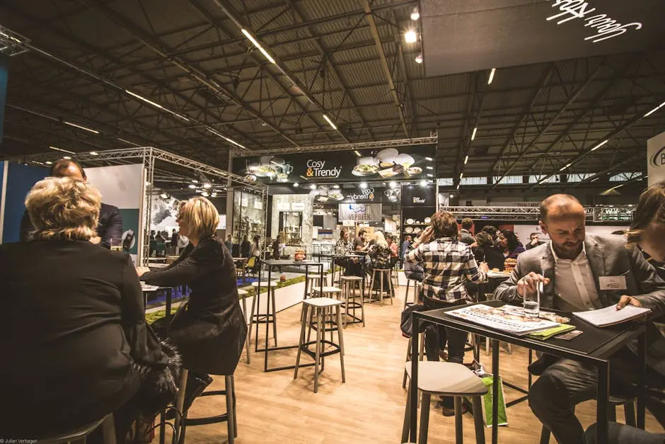
How Can I Choose the Right Trade Show Display for My Event?
Choosing the right trade show display can significantly impact your event's success. With numerous options available, it can be a daunting task. This guide will walk you through crucial steps to help you make an informed decision that aligns with your goals and stands out to your audience.

Step 1: Define Your Goals
Begin by identifying what you aim to achieve at the trade show. Whether it's increasing brand awareness, generating leads, or launching a new product, your goals will guide your display selection.
Understanding your objectives not only clarifies your vision but also influences your display’s design and messaging. If your focus is lead generation, you'll want to integrate clear calls-to-action and engaging elements.
Setting measurable goals will also help you evaluate your success afterward. For instance, you might track the number of leads collected to determine if your display was effective.
Step 2: Understand Your Audience
Research your target audience. Knowing their preferences, interests, and expectations will help you design a display that resonates with them and encourages engagement.
Beyond just demographics, delve into your audience's behaviors and pain points. What challenges do they face that your product can solve? Addressing this in your display can significantly elevate its impact.
Remember, effective trade show displays often start conversations. So consider ways to invite visitors to interact, like including questions or hands-on demonstrations that speak directly to them.
Having a clear understanding of your potential clients can also help you tailor promotional materials that truly address their needs and engage them more deeply.
Step 3: Choose the Right Display Type
Consider the various types of trade show displays available, such as pop-up displays, banners, and modular systems. Each type offers different benefits, so select one that best fits your needs and space.
Pop-up displays are versatile and portable, making them great for smaller spaces, while large modular systems provide an expansive presence suitable for larger exhibits. Assessing your space can lead to more effective utilization.
Additionally, consider the ease of setup. Displays that are complicated to assemble can lead to wasted time and stress. Opt for user-friendly options that can be set up easily, ensuring you focus on interacting with attendees.
Finally, don’t overlook the possibility of digital displays. Incorporating technology can create a modern edge and draw in tech-savvy audiences with interactive content.
Step 4: Focus on Branding and Design
A cohesive branding strategy is essential. Use colors, logos, and visuals that align with your brand identity. An eye-catching design will attract visitors to your booth.
Ensure your messaging is clear and aligns with your goals. Whether you choose to convey a single powerful message or multiple aspects of your brand, clarity is key. Confusion can deter potential customers.
Incorporating high-quality visuals, such as large images or videos, can enhance your display’s appeal and maintain audience interest. Select visuals that tell your story engagingly.
Finally, don't forget about signage. Strategic placement of signs can guide visitors to essential information and improve navigation within your space.
Step 5: Consider Your Space and Layout
Evaluate the space you will be exhibiting in. Consider the layout of your booth and how your display can optimize the area while ensuring ease of movement for visitors.
Mapping out traffic flow is vital. You wouldn’t want to create a bottleneck that frustrates attendees. Plan the layout logically to facilitate open access and encourage interaction.
Furthermore, incorporate comfortable areas for discussions. A small seating area can be a welcoming place for prospects to sit down, ask questions, and learn more about your offerings.
Step 6: Budget Wisely
Establish a budget for your trade show display. Keep in mind that while it's important to remain cost-effective, investing in a high-quality display can lead to greater returns.
Balancing quality with budget constraints means you might need to prioritize certain elements of your display over others. Key investments, such as quality materials or professional design, can pay off in engagement.
Finally, don’t forget to consider all potential costs, from transportation to logistics. A comprehensive budget will prevent unexpected expenses that could derail your plans.
Final Thoughts on Selecting Your Trade Show Display
By following these steps, you can confidently choose a trade show display that reflects your brand and captivates your audience. Remember to consider your goals, branding, space, and budget when making your selection.

What Are Wide-Format Printing Services?
Wide-format printing services have become increasingly popular in various industries due to their ability to produce large-scale graphics and documents. In this blog post, we'll explore what wide-format printing is, its applications, benefits, and how to choose the right service for your needs.

Understanding Wide-Format Printing
Wide-format printing refers to the printing of materials that exceed the standard sizes of traditional printers. This includes banners, posters, and other large graphics that require specialized printers and materials.
Typically, wide-format printing accommodates media widths ranging from 18 inches to 100 inches or more, allowing for creative flexibility. Whether you're producing eye-catching promotional banners or intricate wall graphics, wide-format printing is designed to handle various dimensions without sacrificing quality.
Another vital aspect of wide-format printing is its capability to use diverse substrates. From paper and vinyl to fabrics, the variety of materials aids in creating stunning visual effects that enhance your project.
Common Applications of Wide-Format Printing
Wide-format printing finds its use in various sectors such as advertising, retail, events, and signage. It's ideal for anything from trade show displays to wall murals. The ability to produce large-scale graphics makes it a preferred choice for showcasing products at exhibitions.
Retail environments often benefit from wide-format printing through vibrant window displays, promotional banners, and point-of-purchase materials that draw in customers. Additionally, event organizers utilize these printing services to design backdrops that set the scene for memorable experiences.
One fascinating application is in the art world, where artists leverage wide-format printing to create reproductions of their work. These prints can be displayed in galleries, giving art enthusiasts access to high-quality pieces at a fraction of the original's cost.
Benefits of Using Wide-Format Printing Services
These services offer vibrant colors, quick turnaround times, and the ability to print on various materials, making them perfect for high-impact visuals that grab attention. One of the most significant advantages is the scale—larger prints mean more visibility.
Wide-format printing is also advantageous for customization, allowing businesses to create tailored designs that resonate with their target audience. From size to color to material, the options are seemingly endless.
Moreover, the advancements in printing technology have made it easier to achieve photo-quality graphics while using eco-friendly inks. This means businesses can produce striking visuals while remaining conscious of their environmental impact.
Choosing the Right Wide-Format Printing Service
When selecting a wide-format printing service, consider factors such as quality, material options, turnaround time, and customer service to ensure you get the best results for your project. The right partner can make a significant difference in the quality of your final prints.
Start with a thorough research of local service providers. Look for reviews, previous work portfolios, and any recommendations that confirm their reliability. Don't hesitate to ask questions; understanding their capabilities will help you align your needs with their offerings.
Finally, request samples before making a commitment. Seeing actual prints can provide clarity on texture, color quality, and overall craftsmanship, assuring you that your project will be handled with care and expertise.
Wrapping Up
In conclusion, wide-format printing services offer an array of possibilities for creating vibrant, large-scale prints that can elevate your marketing materials, signage, and more. By understanding what these services entail, you can make informed decisions for your printing projects.

12 Common Mistakes to Avoid When Creating Roll-Up Banners
Creating effective roll-up banners can significantly boost your marketing efforts, but there are several pitfalls that can undermine your success. In this guide, we'll explore common mistakes that many encounter and how to steer clear of them, ensuring your banners make the right impact. Let's dive in and learn how to design roll-up banners that truly shine!

1. Ignoring Your Target Audience
>Understanding who your audience is and what appeals to them is crucial for effective design.
Before even sketching out ideas, take a step back and consider the demographic you're aiming to attract. This means acknowledging their preferences, pain points, and interests. Once you know what resonates with your target audience, you can tailor your roll-up banners to communicate your message effectively. Tailoring content to fit the desires and expectations of your viewers can make all the difference in ensuring those potential customers stop to look.
Moreover, research can spotlight key trends that may influence your design choices. For example, younger audiences might appreciate vibrant, eye-catching designs, while older mature demographics tend to favor a more classic, minimalist look. Remember, aligning your design with what your audience prefers not only increases engagement but also enhances your message's relatability.
2. Overloading with Text
>Less is often more; too much text can overwhelm viewers and dilute your message.
When crafting your roll-up banners, keep in mind that the viewer’s attention span is limited. A wall of text can intimidate or confuse, leading to disinterest quicker than you might expect. Paragraphs filled with critical information might seem useful, but instead, opt for concise phrases that communicate your points directly and powerfully. Think of it as a headline; it should capture interest while providing a clear indication of what’s to follow.
Incorporating bullet points or short, impactful sentences can be a game-changer. For instance, instead of writing a whole paragraph about your services, boil it down to key benefits. Strive for clarity and simplicity, prioritizing important information that can be easily absorbed at first glance. This strategy not only preserves the aesthetics of your banner but also aids in delivering your message effectively and memorably.
3. Neglecting Visual Hierarchy
>A proper visual hierarchy guides viewers through your message and highlights key information.
Creating a visual flow within your roll-up banner is essential for maintaining viewer attention. Essentially, this means prioritizing how the information is presented. Enlarge the most important messages or headings, and use contrasting colors to draw attention. A hierarchical structure gives the audience a roadmap, allowing them to navigate through the banner intuitively. They should easily decipher what to read first and what follows afterward.
Moreover, don’t shy away from using space effectively. Ample white space around significant elements can make them stand out, thus enhancing readability. Misplacing critical information can lead to a jumble of visuals that loses audience interest. Always keep in mind that good design leads the viewer’s eye naturally and ensures that your essential message isn't lost in the design clutter.
4. Using Low-Quality Images
>Always ensure that your images are high-resolution to maintain a professional look.
A blurry or pixelated image can reflect poorly on your brand and turn potential customers away. In a visual medium like roll-up banners, images play a critical role in capturing attention. They should not only be eye-catching but also of high quality. Invest in original photography or high-resolution stock images that align with your message, as this can truly elevate your banner's overall aesthetics.
Additionally, consistency in visual branding is pivotal. If your brand typically uses certain colors or styles in its photos, maintain that throughout your roll-up banner design. This not only builds familiarity but also enhances credibility in the eyes of your audience. Remember, high-quality imagery combined with thoughtful design will markedly increase the chances of a positive impression and a potential sales conversation.
5. Choosing Wrong Fonts
>Fonts should be legible from a distance; avoid overly decorative styles that could confuse your audience.
The typeface you select for your roll-up banners can greatly impact the readability and, consequently, the effectiveness of your message. While creative fonts might appeal to your artistic side, they can pose challenges in familiarity and readability. Aim for fonts that strike the perfect balance between style and clarity—something easily readable at various distances. Proper font size and typeface contribute to your overall message, directly influencing how viewers perceive your brand.
Aside from legibility, consistency in font choice enhances brand recognition. Ideally, use no more than two different fonts—one for headings and another for body text. This keeps your banners streamlined and visually appealing. Strive for a harmonious look where typography aligns with your brand's tone and creates a unified visual experience. Remember, the goal is to communicate, so while font selection can showcase your brand’s character, it should primarily serve to convey your message effectively.
6. Forgetting About Branding
>Every banner should reflect your brand's identity consistently to reinforce recognition.
Branding is not just about a logo; it encompasses colors, images, and messaging styles as well. When designing your roll-up banners, infuse your brand's personality into every element. From the color palette to the tone of voice used in the text, consistency across materials builds trust and familiarity with your audience. Visitors should be able to recognize your brand at a glance, which is why integrating elements like your logo and brand colors into the design is vital.
Take the time to craft your banners in a way that mirrors other marketing materials, and ensures they align seamlessly with your overarching brand strategy. Consistency builds brand loyalty, and well-executed roll-up banners can entice prospects to seek out your products or services, fostering a stronger connection between your brand and potential customers.
7. Skipping the Call to Action
>Always include a clear call to action to guide viewers on the next steps they should take.
Imagine passing by a beautiful banner and feeling intrigued, yet having no clue about what to do next. A well-defined call to action (CTA) is crucial for converting curiosity into action. Whether it is prompting the audience to visit your website, connect on social media, or make a purchase, having a clear CTA helps bridge the gap between engagement and results. Without it, you risk leaving potential customers in a limbo state.
Your CTA should be prominent and easy to find—set it apart visually from other text by using contrasting colors or different font sizes. Use actionable language, and remember to articulate the value behind the action. Instead of saying 'Visit our website,' try something more engaging like 'Discover more and unlock exclusive offers at our website!' This approach adds enthusiasm and urgency to the message, motivating viewers to respond favorably.
8. Using Clashing Colors
>Color choices should complement each other and enhance readability rather than distract.
Colors evoke emotions and can significantly affect a viewer's perception. Therefore, it’s essential to choose color schemes that harmonize and reinforce your messaging rather than overwhelm your audience. Overly clashing or bright colors can cause visual fatigue and may even discourage people from reading your content. Instead, look for color combinations that create a cohesive look while maximizing readability. Strive for a balance that enhances the visual appeal but doesn’t overshadow the message.
Consider using color theory to guide your palette selection. Complementary colors can create an attractive contrast, while analogous colors help establish a more peaceful tone. A well-thought-out color scheme not only reflects your brand identity but also aids in segmenting information clearly, making your roll-up banners not only aesthetically pleasing but functional as well.
9. Not Considering the Layout
>Effective layout balances text, images, and other elements for smooth flow and clarity.
Layout shouldn't be an afterthought; instead, it's the backbone of a successful roll-up banner. A great design ensures your elements work together cohesively. Start by categorizing the components: where will the primary message go? What images will complement the text? Establishing a solid layout from the outset allows for a seamless integration of visuals and ensures the viewer can engage with the content without disorientation.
Utilize techniques such as the rule of thirds or grid systems to create visual balance. Group related content to foster a more logical flow, guiding viewers naturally from one section to another. Balance is key; it makes the banner not only visually appealing but ensures it functions effectively as a tool for engaging your audience.
10. Ignoring Size Specifications
>It's vital to know your banner's intended display space to ensure it fits perfectly.
Whether you’re placing your roll-up banner at a trade show, in an office, or at an event, understanding the size specifications of both the banner and the display space can save time and money. A banner too large or too small could hinder its visibility, effectively defeating its purpose. Ensure you take accurate measurements before moving forward with your design, and consider how far away people will typically be when looking at it.
Also, bear in mind the typical viewing distance when deciding on font sizes and image placements. Your text should remain legible from afar, while images must remain clear and impactful when seen from the intended vantage point. All of these considerations will contribute to the overall success of your roll-up banner.
11. Overlooking Distribution Logistics
>Plan for how and where your banners will be displayed for maximum effectiveness.
Creating a stellar roll-up banner is only the first step; knowing how to distribute and display it is equally crucial. Prior to any production, consider where these banners will be placed: is it at a conference, a shop, or an outdoor venue? Each context presents different challenges regarding visibility and environmental factors, such as lighting or space constraints.
Understanding the logistics ensures you're prepared. Will you need stands, weights, or special fixtures to secure your banners? Strategizing your installation setup ahead of time minimizes last-minute hurdles. Focusing on both design and logistics in tandem prepares you for success, ensuring your roll-up banners are not just attractive but also functional and impactful in their selected environments.
12. Failing to Test the Design
>Always test your design with a focus group to gather feedback before finalizing.
Testing your design may seem tedious, but it’s one of the best ways to avoid costly mistakes and ensure your roll-up banners resonate with your intended audience. Gather a diverse group of individuals who represent your target demographic and invite them to review your design. What catches their attention? What do they find confusing or indifferent?
Utilize their feedback to make necessary adjustments before going into production. You might discover that a specific message didn’t resonate as you anticipated or that certain elements are not as effective as envisioned. This practice not only fine-tunes your design but builds confidence that your final product will effectively attract attention and convert viewers into customers.

10 Highway Signs That Ensure Safety and Compliance in Construction Zones
Navigating through construction zones can be challenging, but thanks to well-placed highway signs, we can do so safely and effectively. This blog will explore ten essential highway signs that play a crucial role in ensuring compliance and safety while driving through these areas. Let's delve into the signs that help protect both motorists and workers alike!
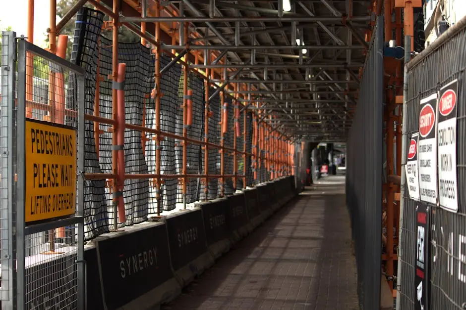
1. The Classic Detour Sign
The classic detour sign guides drivers away from restriction areas, ensuring their safety while facilitating construction work. These signs are often strategically placed at major intersections, allowing motorists to take alternate routes, thus avoiding any potential hazards. It's not only about keeping traffic flowing but also about protecting the workers on site. These signs can truly make a significant difference in the overall construction experience.
While these signs may be a bit of an inconvenience in the short term, they serve a larger purpose. By taking a detour, drivers are not just avoiding delays; they’re helping to create a safer environment for everyone involved. Remember, the time spent routing around construction zones is a small price to pay for the safety of those building or repairing our roads.
2. Reduced Speed Limit Ahead
This sign warns drivers to slow down before entering a construction zone, helping to minimize accidents. A reduced speed limit is crucial, given that construction zones are often full of unexpected obstacles and workers moving about. When drivers pay attention to this sign, they give themselves more time to react to changing conditions, which can be life-saving.
The importance of adhering to reduced speed limits cannot be overstated. Speeding not only jeopardizes the driver’s safety but also the safety of construction workers. When you see this sign, think of it as a reminder to maintain a safe distance from other vehicles, watch out for personnel, and prepare for sudden stops. After all, a few extra minutes can go a long way in preventing accidents.
3. One Lane Road Sign
When a road is narrowed to one lane, this sign alerts drivers to prepare for merging, keeping traffic flowing smoothly. This transition can often be a source of stress for many drivers, as they navigate the merge while being mindful of other vehicles. Thus, the one lane road sign serves as a crucial guidepost for both experienced and novice drivers alike.
By alerting drivers about the upcoming one-lane situation, the sign encourages a collaborative spirit among motorists. It's a gentle nudge to remind everyone that sharing the road is essential, especially in construction areas. When everyone merges safely, it can prevent bottlenecks and minimize frustration, leading to a more seamless driving experience.
4. Construction Zone Ahead
A proactive alert that informs drivers of upcoming construction to ensure they prepare to adjust their driving behavior. This sign serves as an early warning to motorists, giving them time to reduce speed and be more vigilant about their surroundings. By acknowledging this sign, drivers can set their expectations for potential delays and road changes.
Moreover, the construction zone ahead sign plays an essential role in fostering driver awareness. It sets the stage for a shift in focus towards safety. With this sign, the onus is on drivers to remain alert, keeping an eye out for not just signs, but also workers and equipment. By taking heed, you can help facilitate a smoother intersection between roadwork and daily commuting.
5. Men at Work Sign
This sign emphasizes that workers are present and encourages drivers to be cautious, promoting safety for all. It's a visual cue to remind motorists that there are people actively involved in making our roads safer and more functional. A moment of caution, in light of this sign, can lead to preserving a life—whether that is a worker or another driver.
Seeing this sign should evoke a sense of responsibility among drivers. It's not just about adhering to rules; it's about recognizing the human effort behind construction. As you pass these areas, take a second to appreciate the hard work being put in while being committed to driving responsibly. This shared awareness fosters community-friendly road use.
6. Flagger Sign
Indicating the presence of flaggers, this sign is crucial for directing traffic and ensuring safe passage through work zones. Flagger signs remind you that human assistance is available and essential in these construction areas. These individuals are trained professionals dedicated to safeguarding public safety.
The flagger sign not only serves as a warning but also acts as a communication tool between drivers and workers. It's a visual representation of an organized effort to manage traffic safely. Following the directions given by flaggers should be a reflexive action to help ensure everyone's safety, highlighting the importance of cooperation on the road.
7. No Entry Beyond This Point
A clear directive for drivers to avoid entering areas deemed dangerous or off-limits for unauthorized personnel. This sign is instrumental in protecting both drivers and construction workers. Compliance ensures that only authorized personnel are in potentially hazardous zones, thereby reducing the risk of accidents.
It's important to view the no entry sign not as an inconvenience but as a necessary precaution. What lays beyond that sign may be fraught with danger, and staying out can help save lives. So, when you see this directive, it’s wise to respect it. Remember, it’s better for all if everyone adheres to established boundaries.
8. Temporary Traffic Signals
These signals manage traffic flow, making it easier for vehicles to navigate through changing road conditions. Temporary traffic signals help facilitate orderly movement, ensuring that all drivers have their fair share of the road. It’s amazing how something as simple as a traffic light can optimize safety.
In construction zones, the incorporation of these signals maximizes efficiency. They allow for seamless transitions, especially in areas where traditional road rules may not apply. By responding correctly to these signals, drivers play an active role in maintaining road safety while contributing to smoother traffic movement.
9. Pedestrian Crossing Sign
In construction zones where pedestrians may need to cross, this sign enhances safety for both drivers and walkers. Protecting pedestrians is a vital aspect of road safety, and this sign acts as a crucial reminder for drivers to be vigilant. Recognizing that construction workers may need to cross amidst ongoing work enhances everyone's safety.
Additionally, the pedestrian crossing sign helps to raise awareness among motorists regarding the presence of vulnerable road users. Respecting designated crossing areas not only assists pedestrians but fosters a culture of kindness on the road. This awareness can significantly reduce the risk of accidents, encouraging safer interactions between drivers and pedestrians.
10. End Construction Zone Sign
This sign indicates to drivers when they can resume normal driving conditions, restoring a sense of relief. There's something reassuring about seeing this sign; it feels like a welcome return to familiar territory after navigating uncertainties. It commemorates the end of an important process while encouraging continued observance of driving habits.
Furthermore, as you pass this sign, it’s a gentle reminder that no matter how challenging the journey may have been, getting back to usual driving can feel like victory. Acknowledging the efforts that have been made during the construction process, drivers can appreciate the new roads and improved safety measures put in place after the work is completed.

Eco-Friendly Printing: An Essential Guide for Modern Businesses
In an age where sustainability is more important than ever, eco-friendly printing has become a vital practice for modern businesses. Whether you're a small startup or a large corporation, understanding how to implement environmentally friendly printing solutions can not only reduce your carbon footprint but also resonate with eco-conscious customers. This guide will walk you through everything you need to know about eco-friendly printing, from materials to processes, helping your business lead the way in sustainable practices.

Understanding Eco-Friendly Printing
Eco-friendly printing is more than just using recycled paper. It encompasses a wide range of practices aimed at reducing environmental impact. This section will explain the principles of eco-friendly printing and why it is essential for businesses today.
At its core, eco-friendly printing targets several environmental concerns. It includes minimizing waste, conserving energy, and using non-toxic materials. These considerations stem from the understanding that traditional printing practices often contribute significantly to pollution and deforestation. By understanding these impacts, businesses can begin to appreciate the necessity of adopting greener alternatives.
Moreover, integrating eco-friendly printing into your business strategy is also about enhancing your brand image. Today's consumers are increasingly environmentally aware and prefer brands that take meaningful action in sustainability. Consequently, businesses that embrace eco-friendly printing not only benefit the environment but also position themselves favorably in a competitive marketplace.
Choosing Sustainable Materials
Selecting the right materials is crucial for eco-friendly printing. From paper options to inks and additives, this section will guide you through sustainable choices that reduce waste and promote recycling.
When it comes to paper, look for certifications like Forest Stewardship Council (FSC) that ensure responsible sourcing. Additionally, opting for recycled paper is a smart choice. Not only does it conserve raw materials, but it also reduces energy consumption compared to producing new paper. Choosing papers with high recycled content can significantly amplify these benefits.
Inks play a prominent role too. Many traditional inks contain harmful chemicals that can emit volatile organic compounds (VOCs). Switching to soy or vegetable-based inks can help mitigate these risks while providing vibrant colors. Furthermore, eco-friendly inks often boast easier clean-up and lesser environmental impact, making them an excellent choice for conscientious businesses.
Lastly, consider the impact of additives and coatings. Water-based coatings and biodegradable laminates are excellent alternatives to traditional plastic laminates that often end up in landfills. Each small decision contributes to a larger commitment to environmental stewardship, encouraging a culture of sustainability within your business.
Eco-Friendly Printing Techniques
Not all printing methods are created equal. Here, we'll explore various eco-friendly printing techniques such as digital printing, vegetable-based inks, and energy-efficient processes that can help lower your environmental footprint.
One of the forefront techniques is digital printing, which minimizes waste by allowing for smaller print runs. Unlike traditional methods that require extensive setup and resources, digital printing streamlines the process and uses only the necessary materials for each project. This reduces excess inventory and ensures that fewer resources are squandered.
Another avenue worth exploring is the use of energy-efficient printing technologies. Innovations such as LED UV printing not only reduce energy consumption during the printing process but also expedite drying times, contributing to quicker turnaround. Embracing such cutting-edge technologies positions your business as a leader in eco-friendly practices.
Furthermore, the application of zero-waste principles in printing operations can significantly enhance sustainability. This involves careful planning to utilize every scrap of paper and ensure recycling practices are in place. Businesses committed to reducing waste are in a prime position to challenge industry norms and inspire peers.
Finding the Right Printing Partner
Partnering with the right printing company is key to implementing eco-friendly practices. This section discusses what to look for in a sustainable printing partner and how to gauge their environmental commitment.
When searching for a sustainable printing partner, seek companies that prioritize transparency in their practices. Look for certifications that denote their commitment to environmental responsibility. Whether it's being ISO 14001 certified or having established sustainability programs, these indicators can help you evaluate their dedication to eco-friendly printing.
Additionally, open communication with potential partners is vital. Ask questions about their sourcing methods, waste management strategies, and energy use. The right printing partner will not only provide answers but will also be eager to share their sustainability journey and how they can align with your values.
Lastly, consider a partner's innovation capabilities. Companies that invest in research and development for eco-friendly solutions demonstrate a proactive approach to sustainability. Collaborating with such partners not only helps reduce your environmental footprint but also fosters an atmosphere of improvement and growth in sustainable practices.
Case Studies of Eco-Friendly Printing Success
Real-world examples can inspire action. In this section, we’ll highlight successful businesses that have transitioned to eco-friendly printing methods and the positive results they’ve achieved.
One standout success story is that of a national apparel brand that eliminated plastic packaging. Transitioning to recyclable materials for their shipping and promotional materials not only reduced waste but also attracted positive media attention. Their commitment to eco-friendly printing resonated with consumers, leading to a reported 15% increase in sales within a year.
Another example can be seen in a local coffee shop that shifted to using compostable coffee cups and eco-friendly labels. This simple step not only enhanced their brand image but also inspired a community-driven recycling initiative. They partnered with locals to set up recycling stations, which further solidified their commitment to sustainability.
The Cost of Eco-Friendly Printing
One common misconception is that sustainable printing is always more expensive. This section will break down the costs and savings over time, demonstrating that eco-friendly printing can be a cost-effective choice.
While initial costs for eco-friendly materials or processes might appear higher, consider the long-term benefits. Eco-friendly printing often results in reduced waste, leading to lower disposal costs. Moreover, many businesses experience a decrease in overall printing volume as they adopt digital solutions, thereby saving money across the board.
Additionally, as demand for eco-friendly products grows, many suppliers now offer competitive pricing for sustainable materials. This expanding market creates opportunities for businesses to adopt greener practices without breaking the bank. This shift encourages more companies to evaluate their printing choices critically, providing incentives for conscious consumerism.
Tips for Implementing Eco-Friendly Practices
Transitioning to eco-friendly printing doesn't have to be overwhelming. This section offers practical tips for businesses looking to incorporate sustainable practices into their printing processes.
Start by auditing your current printing practices. Identify areas where waste occurs and propose solutions. For instance, print materials on both sides of the paper or consider digital formats wherever applicable. By recognizing sticking points in your process, you can pave the way for enhancements.
Engaging your employees in sustainability initiatives can also lead to results. Conduct workshops on eco-friendly practices and encourage suggestions for improvement. When your team is on board, they become advocates for change, fostering a culture of sustainability within your organization.
Finally, set clear goals and measure your progress. Whether it's reducing paper use by a certain percentage or switching to a specific amount of eco-friendly ink, having tangible targets keeps your business accountable and highlights the importance of your eco-friendly commitments.
The Future Is Eco-Friendly Printing
Embracing eco-friendly printing is not just a trend—it's a necessary shift towards a more sustainable future. By making conscious choices about materials, processes, and partnerships, your business can significantly impact the environment positively. Start small and gradually incorporate these practices into your operations, and you'll not only do your part for the planet but also attract a loyal customer base that values sustainability.

Mastering the Art of Construction Signs for Maximum Safety
Construction sites can be bustling with activity, making safety a top priority. One of the most effective ways to ensure everyone stays safe is through the use of construction signs. In this blog, we will explore the various aspects of construction signs, how to use them effectively, and best practices for maximizing safety on construction sites.

Understanding the Basics of Construction Signs
Construction signs serve as essential communication tools on job sites. They convey important messages regarding safety, hazards, and directions. It’s crucial to understand their purpose and how they can impact site safety.
At their core, construction signs aim to inform and protect. By highlighting potential dangers, such as heavy machinery or uneven terrain, these signs play a vital role in accident prevention. Think about it: when workers and visitors can easily identify hazards, they are more likely to take precautions and avoid dangerous areas.
Moreover, construction signs guide individuals through the site. Imagine wandering through a complex site without proper signage. It could lead to confusion, frustration, or even injury. Therefore, having clear and informative construction signs is paramount to ensuring both safety and efficient navigation.
Types of Construction Signs and Their Functions
There are various types of construction signs, including warning signs, regulatory signs, and informational signs. Each type serves a distinct purpose and plays a vital role in maintaining safety in different scenarios.
Warning signs, often marked with bold colors like yellow or red, alert workers to potential hazards. These can range from high voltage warnings to signals indicating falling debris. Their effectiveness lies in their ability to catch attention quickly, allowing individuals to assess risk before entering a hazardous area.
On the other hand, regulatory signs communicate important rules and regulations that must be followed on site. For instance, they might indicate zones where hard hats are mandatory or specify speed limits for vehicles. Adhering to these guidelines minimizes risks and promotes a culture of safety.
Finally, informational signs serve to educate and direct people on the site. They can provide details about ongoing projects, upcoming changes, or whom to contact in case of an emergency. These signs foster an informed environment, ensuring that everyone is well aware of their surroundings.
Designing Effective Construction Signs
An effective construction sign is not only clear and concise but also visually appealing. Using the right colors, fonts, and symbols can enhance visibility and comprehension among all who encounter the signage.
Color plays a pivotal role in sign design. For example, red often signifies danger while green signifies safety. When creating signs, it’s essential to choose colors that evoke the correct emotional response. This can be the difference between a sign that merely exists and one that genuinely alerts individuals.
Additionally, font choice matters. It should be legible from a distance, using sans-serif styles that help in quick recognition. The size of the letters is equally critical; larger letters will be seen from afar, ensuring that vital information is not missed. Symbols, too, can convey meanings faster than words.
Lastly, incorporating reflective materials for outdoor signs can significantly improve visibility at night or in poor weather conditions. Such simple tweaks in sign design can profoundly enhance their effectiveness, ultimately saving lives.
Placement Strategies for Construction Signs
Where you place construction signs is just as important as their design. Ensuring they are visible from a distance and positioned at key decision points can significantly enhance their effectiveness.
Consider high-traffic areas where workers are frequently moving. Signs placed at entry points or intersections can guide individuals clearly, allowing for smooth navigation around the site. It's important that every sign is strategically located.
Also, think about the height at which the sign is displayed. Signs that are too low might not be seen by vehicles, while those too high might go unnoticed by pedestrians. Finding a balance in height can make a huge difference.
Regularly assess the visibility of signs. As construction progresses, obstructions may arise, rendering previously strategic placements less effective. Keeping the signs updated on their locations is crucial for continual safety.
The Role of Technology in Construction Signage
With advancements in technology, digital construction signs are becoming more prevalent. These signs can be updated in real time and can provide dynamic information depending on the conditions of the site.
Imagine a construction site where signs instantly inform workers of changing conditions, such as unexpected hazards or delays. Digital signs offer precisely this advantage, allowing for quick updates and real-time communication.
Additionally, technology can aid in better targeting of messages. For example, using sensors, a sign can display warnings based on real-time observations, such as the presence of heavy machinery moving through an area. This level of responsiveness not only enhances safety but also ensures that personnel are aware of their immediate environment.
The integration of technology also opens the door to innovative designs. Some modern signs incorporate visual and auditory alerts to ensure that the message reaches all individuals, regardless of their field of vision or auditory capacity.
Best Practices for Maintenance and Updates
Regular maintenance and timely updates of construction signs are crucial in ensuring that they remain effective. Deteriorating signs can lead to confusion and increased risk of accidents.
Set up a routine schedule for inspections to assess the condition of all signage. This practice not only keeps signs in good working order but also serves as a reminder for everyone to remain vigilant about safety.
Moreover, when a sign is damaged or becomes outdated, it should be replaced immediately. Delays in this process can pose serious risks. A proactive approach can significantly reduce incidents and foster an environment of safety.
Engaging team members in the maintenance process can enhance awareness. By involving construction workers in regular maintenance checks, we foster a community-driven attitude towards safety and responsibility.
The Importance of Effective Signage in Construction Safety
By investing time in understanding and implementing the right construction signs, we can create a safer environment for workers and the general public alike. Remember, safety is everyone’s responsibility, and effective signage plays a crucial role in fostering a culture of caution and awareness.